According to a new infographic shared by Paul Corrigan of Southeastern University, the answer is NO.
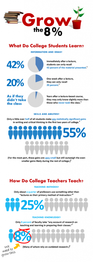
In “Grow the 8%“, Paul cites research that suggests that only a quarter of higher education professors use something other than lecture as their primary method of instruction, and only 8 percent of faculty take into account the research on teaching and learning. The surveys by Fink and Bok are somewhat dated, so I wonder in this post-Web 2.0 world if these figures are still as accurate?
In our own work with faculty, we surveyed faculty that had completed a one-year institute with us on online teaching and learning. 57% self-reported that they had reviewed research studies on online teaching and learning. This could suggest that once faculty members are sensitized to the value of research, a more significant percentage than 8% continue to use it.
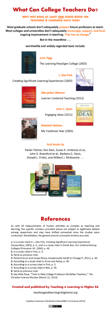
Paul’s bottom line suggestion is that faculty members should read at least one good book on teaching and learning each year, and he lists some good books. As I have frequently reviewed books in this blog, I would tend to agree with his recommendation!
I would be interested in your thoughts. Do you agree with Paul’s findings?
{Graphic: Teaching & Learning in Higher Ed}
I’m glad that you found the infographic worth reflecting on and sharing. Thank you.
I’m also glad that you’re questioning the data. Even though I put the numbers together in making the infographic, I have some hesitations about how I’ve framed them. In particular, I would like to see the numbers better contextualized and qualified.
So I’ve just now made a few small edits to the infographic to give the numbers at least a little more context. For instance, where the earlier version simply read “students can . . .”—suggesting, perhaps, all students at all times, with the caveat “in a study” tucked away into a reference—the new version now reads “students in a study could . . .”—more accurately indicating the situated nature of the evidence, even while still implying, I think, that something similar probably applies to many students.
The infographic mode doesn’t necessarily lend itself to nuanced contextualization and qualification of the sort that such data would ideally be treated with. It aims to communicate a data-driven message clearly and starkly. In this case, that message is that the empirically-demonstrated problem of college students not learning as much as they could and should probably has something to do with the empirically-demonstrated problem of college teachers not learning about learning as much as they could and should.
The particular numbers cited get this point across somewhat dramatically. But, of course, they don’t tell the whole story when presented with so little context. One wants to know how these numbers were come up with, with what methodology, in what context, how generalizable the results are likely to be, whether they still apply with a certain amount of time passed from the original study, etc. (To be fair, with the references provided, one could do that sort of follow up. And I think that my edits help a little as well.)
But finally the purpose of the infographic is to encourage teachers to learn more about these things for themselves. It is more about getting conversations started than about finishing them. One can only get the “full” context that way anyway.
You ask whether things have improved since the studies cited about faculty teaching practices and knowledge were conducted. While I imagine and hope that they have, at least somewhat, I doubt very much that they have improved categorically on a wide scale. But I’m glad to hear about the much better number coming out of your institute. That’s precisely the sort of work I’m hoping to encourage.
Again, thanks for this post.
—
Paul T. Corrigan
Teaching & Learning in Higher Ed.
Thanks for the comment, Paul, and thanks for starting the conversation through your infographic. Some improvement, but much work still to be done…in a shifting higher education landscape!